Interview|Akiko Wakabayashi

Photography by Riho Harashima

Interview|Akiko Wakabayashi

デザイナー 若林亜希子が「Duality」を紐解く

「Lula BOOKS」より発売された、写真家 田中雅也の初となる写真集「Duality」。

「偶発を生みたい」という作家の想いは、
複数種の紙、中綴じ、イエローのゴムなど、実験的な要素を組み合わせたその装丁にも映し出されている。

Lula Japan Webでは、オランダ・ティルブルフを拠点に活動する本作のアートディレクター Akiko Wakabayashiにインタビュー。
デザインの裏側、自身のバックグラウンド、本をめぐる環境の地域差や先行き——彼女の眼差しを通して「Duality」の面白さ、そして本というフォーマットの可能性を見つめる。


‘Duality’, the first photo book by photographer Masaya Tanaka, is now on sale from the publishing project “Lula BOOKS”.

The artist’s intention to ‘create contingency’ is reflected in the book design, which combines experimental elements such as multiple types of paper, saddle-stitched binding, and the yellow-colored band.

Lula Japan Web interviewed Akiko Wakabayashi, the art director of this book, who is based in Tilburg, the Netherlands.
She talks about behind the scenes of the design, her own background, regional differences in the environment surrounding books, and the future of books.
Through her eyes, we take a close look at the fascination of ‘Duality’ and the possibilities of the format of books.


>アーティストインタビューはこちらから

-田中さんは「若林さんが、自分の言ったことを汲み取って素敵な形にしてくれたのが嬉しかった」と話してくれました。田中さんの写真からは、どのようなことを感じましたか?

私にとっては、作家の方と最初にお話しすることがかなり重要です。田中さんはご自身の本の好みを率直におっしゃってくれたので、今回は核になる部分をうまく聞くことができました。
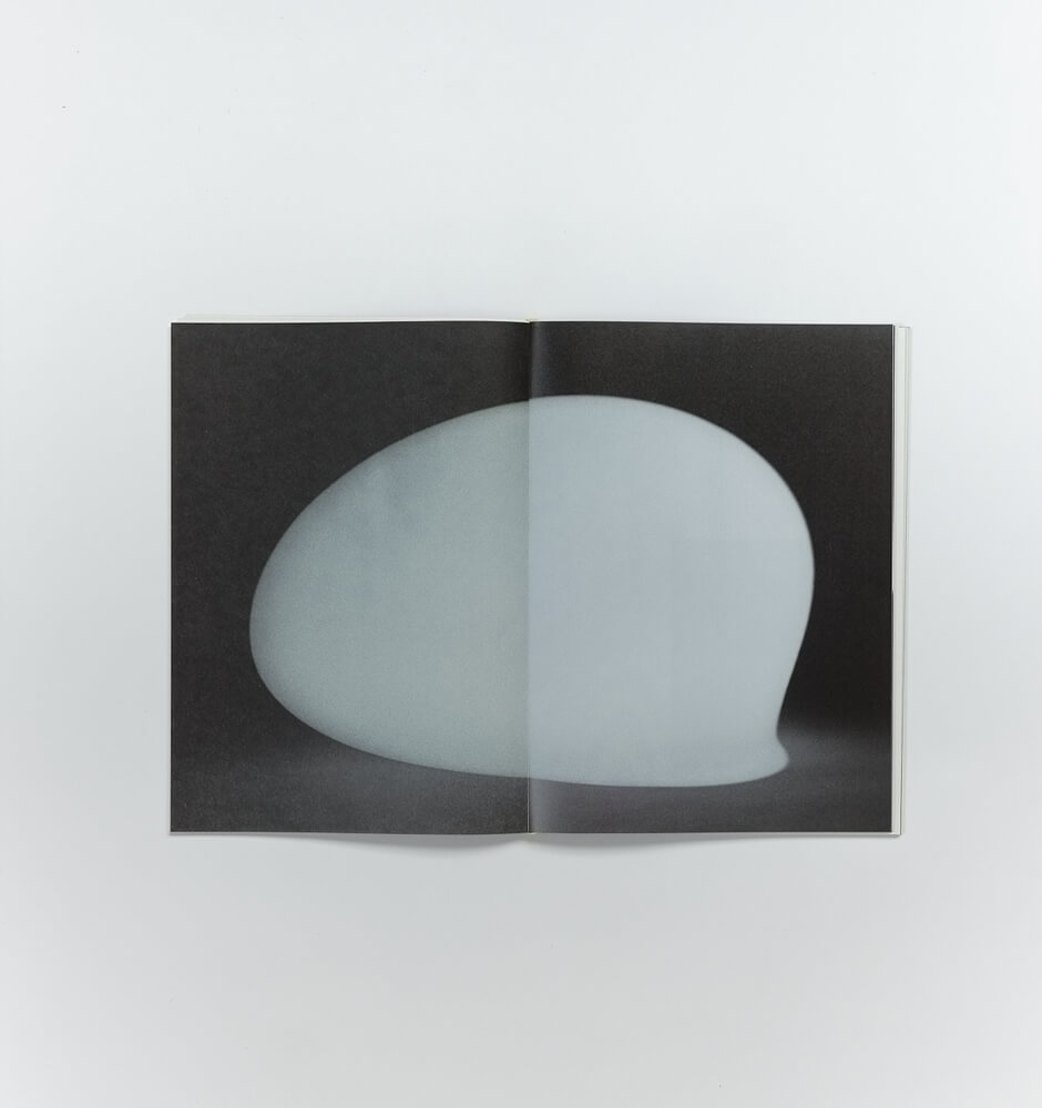
ステートメントにある「相反するものの共存」といった、中間領域に美意識を見出す感覚は私の中にもあります。制作の過程で田中さんが「この写真は狙いすぎているかもしれない」などとおっしゃっていたのも、感覚的に分かるなと感じました。

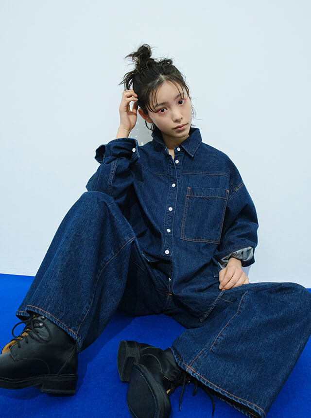
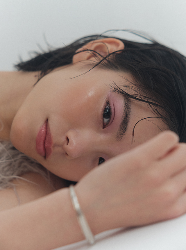
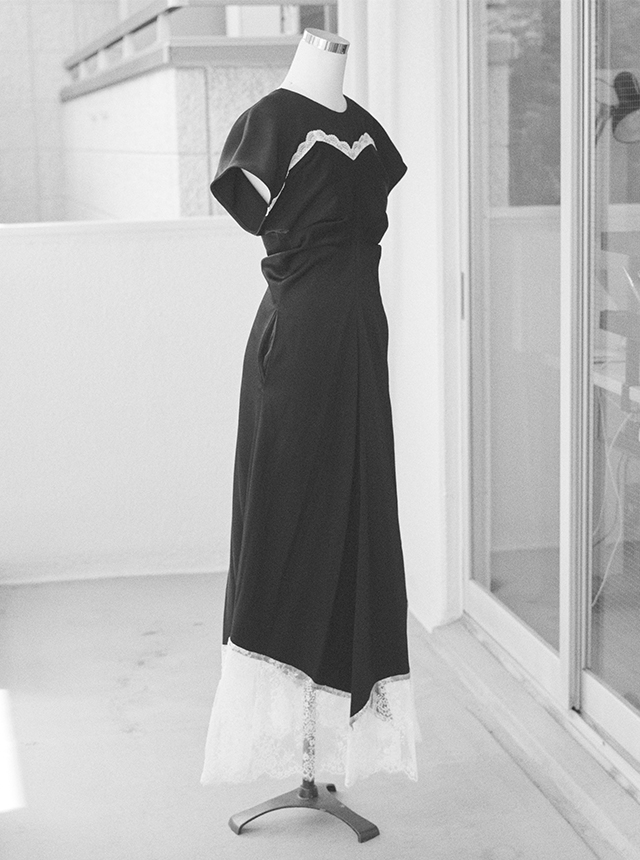
田中さんの写真からは熟練した「見る、探す、切り取る、待つ、感じる、再構築する」を感じます。
今回のようにシリーズとして制作されていないイメージの集合体は、写真集となることで見えてくるものが大きいと思います。本にすることの意義と可能性を感じました。

-Masaya told us that he was happy that you took what he had said and made it a wonderful form. What did you feel from his photography?

For me, the initial talk with the artist is quite important. Masaya shared his own book preferences openly, so I was able to successfully catch the core of what he wanted to do this time.
The sense of finding aesthetics in the intermediate range, such as the ‘coexistence of opposites’ mentioned in the statement, is something I also have in mind. During the production process, he said something like “This photograph may be too intentional”, and I felt that I could understand that sensation.

From his photographs, I sense a skilled “seeing, searching, capturing, waiting, feeling and reconstructing”.
I believe that a collection of images that have not been produced as a series, such as this one, can reveal a great deal by being turned into a book of photographs. I felt the significance and potential of making a book.


-装丁においてこだわった点を教えてください。異なる3種類(表紙を含めると4種類)の紙をミックスするというアイデアが面白いですね。

そうですね。紙をミックスすることを提案したいと思えたのは、田中さんと最初にお話しした時、印刷された写真がどう出てくるかを楽しむという実験的なことができそうだと感じたからです。こうしたことが自然にできるプロジェクトって、実はあまりないんですよ。

「相反するもの」というと2種類にもできますが、そこにもう1つプラスすることでより曖昧になる。それ以上行くとやり過ぎになってしまうので、中面には3種類使用しました。

あとは私自身、実際にどう色が出てくるか見たかったのもあって、全部違うタイプの紙を選んでいます。実際には最初に提案したものとは違う紙になっているのですが、それも含めて楽しみました。「これは難しいけれど、こんなのがあるよ」という印刷所の方の助言を、面白いこととして受け取っています。

ゴム綴じにしたのは、本が何かの拍子にバラバラになってしまい、元の順番が分からなくなって新たなシークエンスが生まれても良いかな、というくらいの曖昧さを残したかったからです。

平ゴムは丸ゴムより紙になじむので、いつか使用してみたいアイテムでした。ただ本が開きにくくなることもあるので、耐久性なども含めて編集部の方々に確認しながら選んでいます。
今回の本ではノドがフラットに開くことや開きの良さを重視するよりも、前半と後半での開きの違いをポジティブに受け止めて決めました。
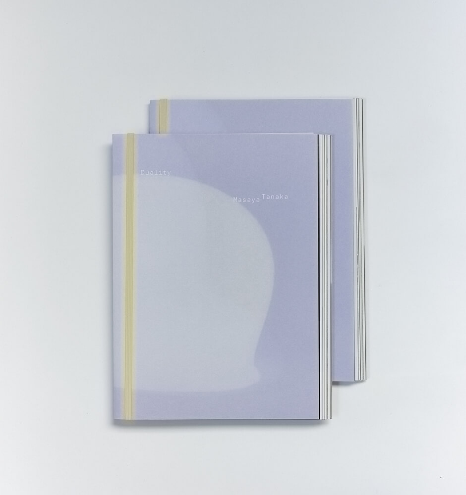
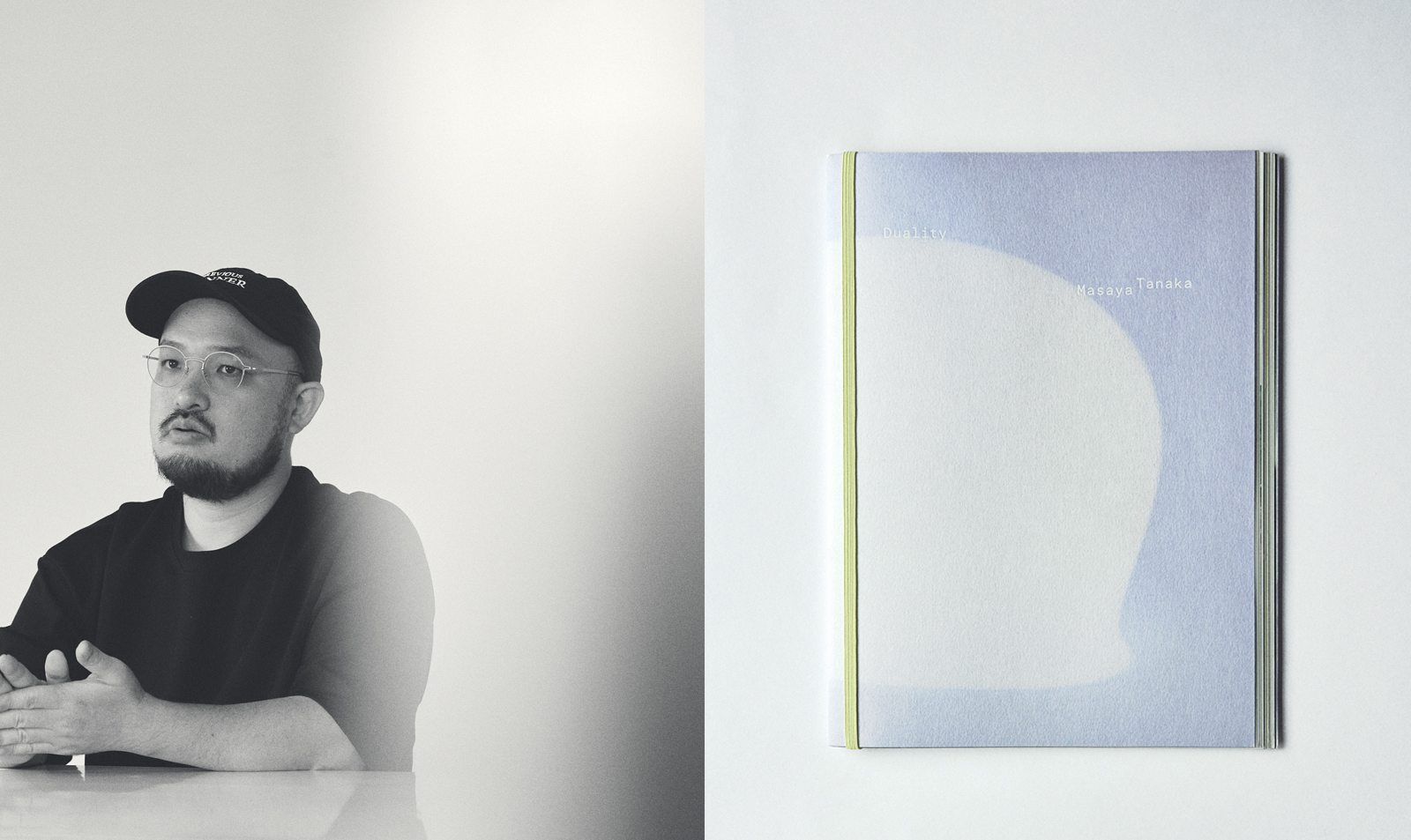
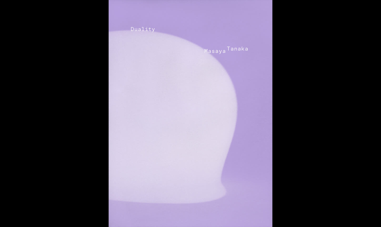
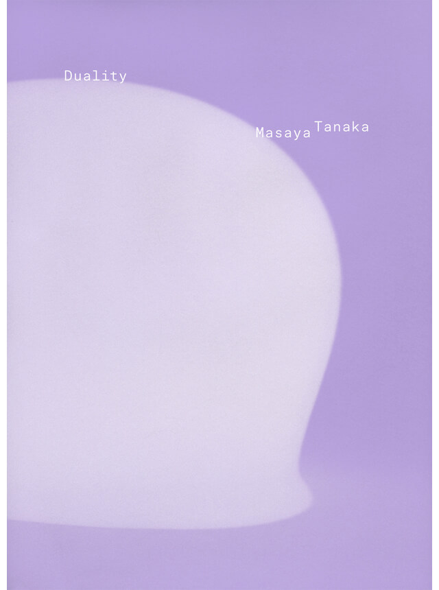
カラーは表紙の紫が先に決まっていたので、それと相性の良い中間色にしています。紫も黄色も、赤、青、緑などに比べて色から連想する意味合いが強くないという部分が選択の助けとなりました。

-What did you focus on in this book design? The idea of mixing three different types of paper (four including the cover) is interesting.

That’s right. The reason I would like to propose the idea of mixing paper is that when I first spoke with him, I felt that we could be experimental and allow ourselves to enjoy how the printed photos would appear. There are actually not many projects where this kind of thing can be done spontaneously.

The word ‘contradictory’ could be expressed with two types of paper, but adding one more thing makes it more ambiguous. If I added more, it would be too much, so I used three types for the middle side.

I also wanted to see how the colors would come out, so I chose different types of paper for all of them. Although the types of paper were changed from what I had initially proposed, I enjoyed that as well. I took the advice of the printer, who said, “This is difficult, but here is something like this instead” as something interesting.

I chose this binding style because I wanted to leave enough ambiguity to allow the book to fall apart at some point, so that the original order could be lost and a new sequence could be created.

Flat elastic is more conformable to paper than round elastic, so I would like to use it one day. However, it can also make it difficult to open the book, so I chose it while checking with the editorial team, including its durability.
For this book, rather than focusing on the flat opening of the inside margin or the ease of opening, we decided on a positive difference in the opening between the first and second halves of the book.
As for the color, the purple on the cover had been decided first, so I selected a neutral color that went well with it. The choice was helped by the fact that neither purple nor yellow have strong connotations associated with some meanings compared to red, blue or green.


-表紙の紙についても聞かせてください。

本の形態から、自然とソフトカバーに決まりました。
ページ数が決まっていった段階で、本文のみでもしっかりした本になりそうだと感じ、表紙の素材も何かしらの存在感があるものにできればと思ったんです。それで、手元にある見本帳の紙の中から選びました。
この紙からは、和菓子の包みのような印象を受けます。その「包んでいる」感じは、表紙の役割にも通じるのかなと。

初めはこの紙には印刷をせず、1ページ目を透かして見せることを想定していました。ですが束見本で確認したところ、透け感があまりなかったんです。そこで印刷をしてみると、インクが沈んで紫の印象が随分変わる面白い出方になったので、少しスリリングではありましたが印刷する方向にさせていただきました。

-Please tell us about the cover paper.

From the format of the book, we naturally decided on a soft cover.
As the number of pages was being decided, I felt that it would be a solid book even with just the body, and I wanted the cover material to have some kind of presence. Then I chose it from the paper sample books I had on hand.
This paper gives the impression like the wrapping of a Japanese confectionery. I think that the ‘wrapping’ feeling can also be connected to the role of the cover.

Initially, we did not print on this paper and intended to show the first page transparently. But when I checked the sample bundle, there wasn’t much transparency. Then, when we printed it, the ink sank and the impression of purple became very different and interesting, so we decided to print it, even though it was a bit thrilling.


-中面のデザインは、どのような点を重視しましたか?

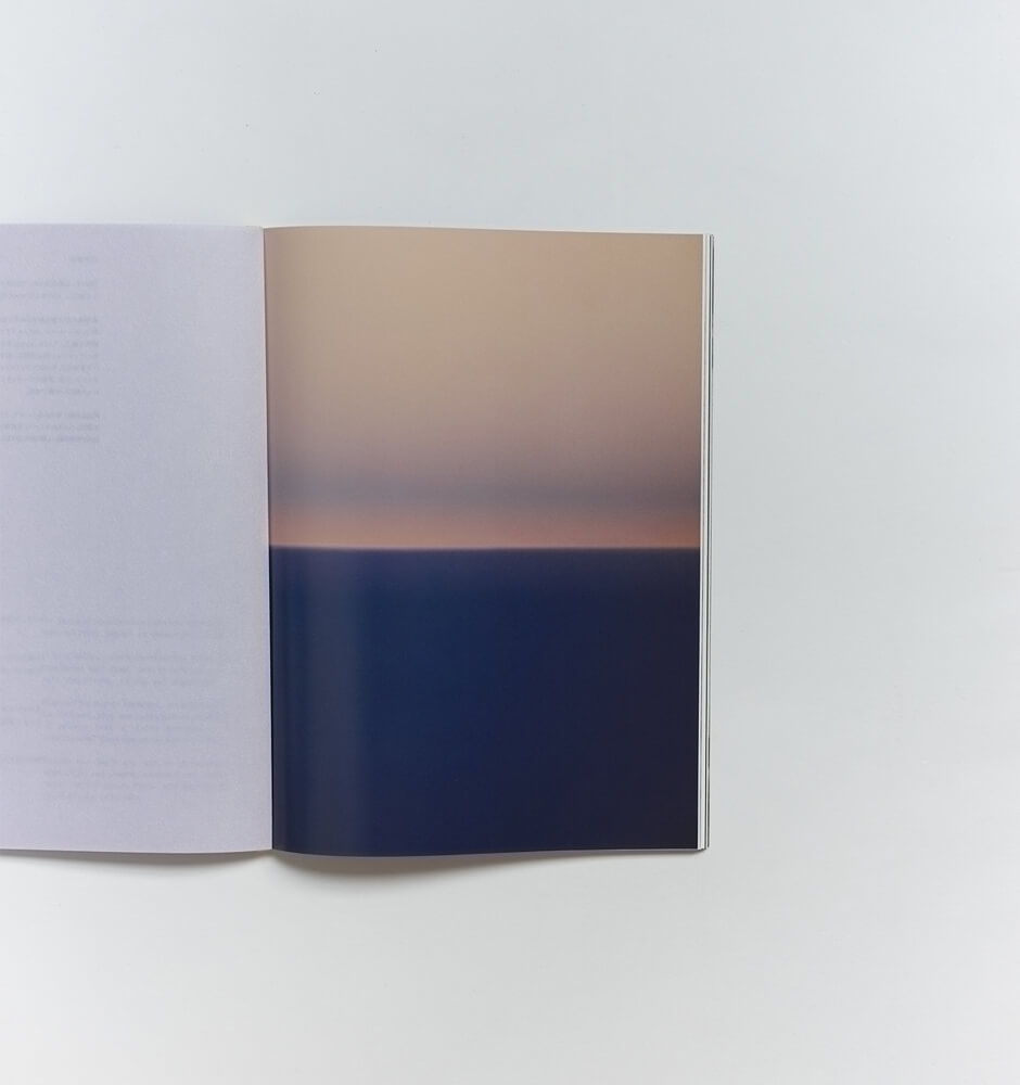
写真集は見開きの組み合わせやシークエンスが重要ですが、この本の場合は紙の並びのシステムという要素もあります。なので、それぞれの紙に合ったイメージが乗っていそうだけど、そうでないところもあるような、その微妙なバランスを考えながら制作しました。白黒の写真は絶対にこの紙、とかではなく、それがグレーになっていくような——ストラクチャーがありそうでない、一方で全体としてはまとまっている感じになれば良いなと。

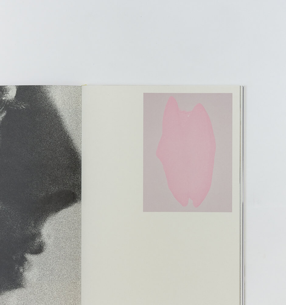
あとは小さくした写真と大きくした写真を混ぜたり、表側から裏側にイメージを繋げたページも入れたりして、ロジカルな部分と感覚的なものをミックスさせています。

-What did you value in the design of the inside pages?

In photo books, the combination of images in the spreads and the sequence are important, but in the case of this book, there is also the element of a system of paper arrangement. So I did not try to decide that black-and-white photographs would be on this kind of paper, but rather that it would become grey. I hoped that it wasn’t structured, but on the other hand, cohesive as a whole.

Furthermore, I combined the logical and the intuitive by mixing smaller and larger photos, and by including pages with images connected from the front side to the back side.

-「Lula BOOKS」には「アーティストの世界観を編集の視点で再構成する」というコンセプトがあります。若林さんはさまざまな作品集を手がけられていますが、アーティストの作品を踏まえてデザインを制作する際、どのようなことを大切にしていますか。

デザインする立場も、特に本の場合は必然的に「編集」の視点が入ってきます。その第三者の視点がうまくアーティストの作品と交差するのが理想です。ただ、完全にまかせてくれる人もいれば、ヴィジョンが明確な人もいて、プロジェクトによってやり方が全然違ってくるので毎回試行錯誤しています。その点で、最初にアーティストと話すことが大事になるんです。

デザイナーも作る側なので、作品を理解したいですし、そうすると理解したことを表現したくなるものですが……やはりアーティストの作品を使って自分の作品を作る、というようなセンシティブな部分は気をつけていますね。デザインが内容を「翻訳する」みたいなことができると良いなと思っています。

-“Lula BOOKS” has the concept of ‘reconstructing an artist’s worldview from an editorial perspective’. You have worked on a variety of art books and what do you consider important when creating a design based on artist’s works?

The position of the designer, especially in the case of a book, inevitably involves an ‘editorial’ point of view. Ideally, that outsider perspective should go well with the artist’s work. However, some people leave it completely up to me, while others have a clear vision. The approach differs completely depending on the project, then it is a process of trial and error for me every time. In this respect, it is important to talk with the artist at the beginning.

Since designers are also creators, we want to understand the work, and then we want to express what we understand....... I am still careful about the sensitive aspects, such as using the artist’s work to create my work. I hope that my design can ‘translate’ the content.


-今回の取り組みにおいて、アーティストの田中さんや編集チームとはリモートでやりとりを行いましたね。何か印象的だったことはありますか?

ファッションを扱う媒体の方々と関わるのは私にとって社会科見学のような感覚で、計画的に最後に追い込む、という印象を受けました。
色々な人に出会えるのも、デザイナーという立場の面白さですね。

-In this project, you worked remotely with the artist Masaya and the editorial team. Are there some of the impressive interactions?

Working with people in the media who deal with fashion was like a social studies field trip for me, and I had the impression that they drove to the end in a planned way.
Meeting a variety of people is an attractive part of being a designer.

-過去に影響を受けたデザインや本はありますか?

人生が変わった出合い、みたいなネタはあまりないんです。
でも、初めてヨーロッパに来た00s半ばにダッチデザインなどを雑誌で見ていたのが助けになって、最終的にオランダに行き着いた気がします。90s頃に活動していたコンセプチュアルなプロダクトデザインの人など——デザインの姿勢のようなものに惹かれたのかもしれません。

元々本に関わることをしたくてこちらに来たので、学校を卒業した後に世界的なグラフィックデザイナー Irma Boomさんのもとで少し働かせてもらったこともありました。彼女のことを初めて知ったのもオランダに来る前の雑誌の中だったと記憶しています。

-Are there any designs or books that have influenced you in the past?

I don’t have a story like a life-changing encounter.
But I think it eventually led me to the Netherlands, looking at Dutch design in magazines when I first came to Europe in the mid-00s. Maybe I was attracted to something like the attitude of the designers who worked in the field of conceptual product design in the 90s.

I was always interested in doing something related to books, and after I graduated from school, I worked for a bit at Irma Boom Office, a worldwide graphic designer. I remember that I first knew of her from a magazine I saw before coming to the Netherlands.


-現代における「紙の本」の存在について、どのように捉えていますか。

最近、2013年頃の「The Most Beautiful Swiss Books」(スイス連邦文化局が毎年開催しているブックアワード)のカタログを読み返していたら、本がなくなっていく不安に駆られているテキストが出てきました。
そこから10年くらい経ち、少なくともオランダでは本作りが昔ほど簡単にはできなくなってきていますが、一方で本はなくならないということが明らかになった印象はあります。
今は逆に、昔オンラインがすごく自由で可能性に満ちた場所だと信じ切っていた人たちの方が不安になっている感じがしていて。規制が厳しくなったり、AIが全部やってくれたり……。

Lula Japanのように雑誌を作られている方にとって、オンラインに切り替えるかは難しい選択ですよね。
でも、やはり紙のものはデジタルよりも確実に残る時間が長いので、残すことの責任を感じながら作っています。

写真集を見ていても、今回のように少部数をこだわって作って適正な価格で売る、という方向にシフトチェンジする出版社が多くなっています。他方、自分の表現したいことがすぐにできるZINEも手法の1つとして残っていくんだろうなと感じますね。

-How do you view the existence of ‘paper books’ today?

Recently, I was reading through the catalog of ‘The Most Beautiful Swiss Books’ (an annual book award organized by the Federal Office of Culture) around 2013, and I came across a text about the anxiety that books are disappearing.
About 10 years have passed since then, even though book making is not as easy as it used to be, at least in the Netherlands, I have the impression that it has become clear that books are not going away.
Now, in contrast, people who used to believe that the online world was a place of great freedom filled with possibility seem more worried. Regulations are getting stricter, AI is doing everything for us.......

For people like you who produce magazines, it is a difficult choice whether to switch to online.
For my part, I still feel a responsibility to preserve the printed items because they will definitely remain longer than digital ones.

Looking at photo books, many publishers are shifting their focus to making a small number of copies and selling them at a proper price, as in this case. Meanwhile, I feel that ZINE, which allow people to express what they want to express immediately, will probably remain as one of the methods.

-オランダと日本で、本をめぐる状況に違いはありますか?

日本ではここ最近、アートブックフェアが定番化した気がします。昔はもっと専門的な人だけだったけれど、若い人も行くようになって。いつも思いますが、日本の人って結構買うんですよね。オランダではあまりアートブックフェアがなく、本も買わないんです。海外から来た人の方が買っている印象があります。
私が普段関わっているフィールドにおいて、オランダ国内のみのマーケットで本を作ることはほとんどありません。そのため、言語は英蘭表記、あるいは英語だけの場合もあります。日本の本は国内向けだけでも成り立つことが多い印象です。

オランダは一方で、「作る」文化がまだまだ残っています。私もたまに学生からインターンのお願いをもらうこともありますし、本を作りたい若い世代は結構いて、デザイナーは今後も豊富に出てくると思います。ただ、以前のようにスターデザイナーが率いていくのではなく、国を超えて何かを共有する集合体、あるいは同時多発的な形になるのかなと感じています。そういった意味では、デザインの部分はあまり国による違いはないのかもしれません。
でも、ローカルな「作る」場所である印刷所がどんどんなくなっているので悲しいです。働く人も高齢化していて、技術を継承していくのが難しい状況になっています。

日本は、今後も本を作れる体制が心配なく続いていきそうだと感じます。日本製の紙は種類もすごく豊富で、以前に比べて製本所もオープンになり、面白いことや変わったことをしている本がたくさん生まれているなと。
印刷会社も、日本は大小があって選ぶことができますよね。今回ご一緒した八紘美術さんは比較的小さなスケールで、細かいコミュニケーションができるなと思いました。

-What are the differences in the situation regarding books between the Netherlands and Japan?

Art book fairs seem to be becoming a standard in Japan in recent years. It used to be only for more specialized people, but now young people visit them as well. I always think that Japanese people buy quite a lot. In the Netherlands, there are not many art book fairs, and people rarely buy books. I have the impression that people from abroad buy more.
In the fields I am usually involved in, the books are not produced only for the Dutch domestic market. Therefore, the language is written in English-Dutch or only in English. My impression is that many Japanese books can be made solely for the domestic market.

The Netherlands, on the other hand, still has a ‘creating’ culture. I sometimes receive internship requests from students, and there are quite a few young people who want to make books. I think there will be an abundance of designers in the future. But I feel that instead of being led by a charismatic designer as before, it will be a collective or simultaneous form of designers sharing something across countries. In that sense, there may not be much difference between countries in terms of design.
However, I am sad about the fact that printing houses, the local places where ‘production’ takes place, are disappearing rapidly. The number of workers is also aging, making it difficult to pass on skills.

I feel that Japan will continue to have a system for making books without worry. There is a huge variety of paper made in Japan, and bookbinders are more open than before, and I see many books being created that do interesting and unusual things.
In Japan, there are large and small printing companies to choose from as well. Hakkou Bijutsu, the company I worked with this time, is on a relatively small scale, and I thought we were able to communicate in detail.


-若林さんの中で、本作はどのような位置づけになりますか。また、今後やってみたいことがあれば教えてください。

今回はやはり、今までご一緒したことのなかった方々と仕事ができたのが面白かったです。
今後でいうと、出版するとか、小さい書店をやるとか、違う形の本との関わり方というのは考えていますが、まだ夢物語です。今は移民として子育てをしながら、デザイン業を全うしたいと思っています。

-How would you position this work in your mind? Besides, is there anything you would like to do in the future?

It was stimulating for me to create with people I had never worked with before.
In terms of the future, I have been thinking about other ways to work with books, such as publishing or opening a small bookstore, but it’s still a dream. For now, it is already a challenge for me as immigrant, being parent and running a design practice.

Akiko Wakabayashi:
デザイナー。長野県出身。
オランダ、アムステルダムにあるヘリット・リートフェルト・アカデミーのグラフィックデザイン科を卒業。Irma Boom Office勤務を経て独立。
ブックデザインの分野を中心に、さまざまな個人や組織とのプロジェクトを手がけている。
WEBSITE:www.akikowaka.com

A designer. Born in Nagano, Japan.
Graduated from the graphic design department at Gerrit Rietveld Academie in the Netherlands and worked at Irma Boom Office.
After becoming independent, she has been working on projects with various individuals and organizations, mainly in the field of book design.


【Lula BOOKS “Duality” by Masaya Tanaka】
RELEASE DATE : 2025年5月29日(木)
PRICE : ¥7,700(税込)
SPECIFICATION : ソフトカバー / H287mm × W215mm / 128ページ
ISBN:978-4-910889-14-6
PUBLISHER:Lula Japan Limited.
AVAILABLE TO BUY FROM:
Lula Japan Webstore
通常本
lulajapan.stores.jp/items/67fe3481c0e0b8b2c58a5f4d
サイン本

※数量限定。なくなり次第販売終了
lulajapan.stores.jp/items/67ff4f9ebe5fcdf74b2821b9

Amazon
https://amzn.asia/d/8iIKAi3


STOCKIST:
銀座 蔦屋書店
代官山 蔦屋書店
青山ブックセンター 本店
梅田 蔦屋書店
TSUTAYA BOOKSTORE 下北沢
二子玉川 蔦屋家電
TSUTAYA BOOKSTORE 高松オルネ
BOOK AND SONS
THE BOOK END
軽井沢ニューアートミュージアム
shashasha
楽天ブックス
タワーレコードオンライン
ヨドバシドットコム

その他全国書店・オンライン書店など


【Masaya Tanaka Photo Exhibition “Duality”】
BOOK AND SONS
DATE:6月15日(日)まで開催中
※水曜定休
TIME:12:00pm〜7:00pm
PLACE:BOOK AND SONS
ADDRESS:東京都目黒区鷹番2-13-3 キャトル鷹番
ADMISSION FREE

THE BOOK END
DATE:6月21日(土)〜7月6日(日)
※火曜、水曜定休
TIME:11:00am〜6:00pm
PLACE:THE BOOK END
ADDRESS:兵庫県神戸市中央区海岸通3-1-5 海岸ビルヂング302
ADMISSION FREE

Lula BOOKS

ファッション誌 Lula Japanを発行するLula Japan Limited.が、2021年にスタートした出版プロジェクト。
雑誌の編集的視点を起点に、写真やアート、ファッションと言葉が交わる場を本という形で届けています。
第1弾では俳優・モデルとして活躍するモトーラ世理奈のアーティスト性にフォーカスした「SERENA MOTOLA.」を、第2弾では写真家 熊谷勇樹の活動10年の区切りとなる作品集「Interlude」を、第3弾では俳優やアーティストとして活躍するのんの30歳の節目となる「Non」を、第4弾では写真家 横浪修が取り組む「Assembly」シリーズの最新作「Assembly Teshikaga」を刊行しました。

SHARE

PICK UP