「Complicated(複雑)」
1. まず、イエローという言葉を聞いて、私の太陽星座は獅子座なので、太陽が真っ先に思いつきました。
それは、私の支配星だからです。
私はフランスの南部地方にあるトゥールーズ出身なのですが、そこは「pink city」と呼ばれる太陽に溢れた明るい町です。
パリにいると、トゥールーズが懐かしくなります。
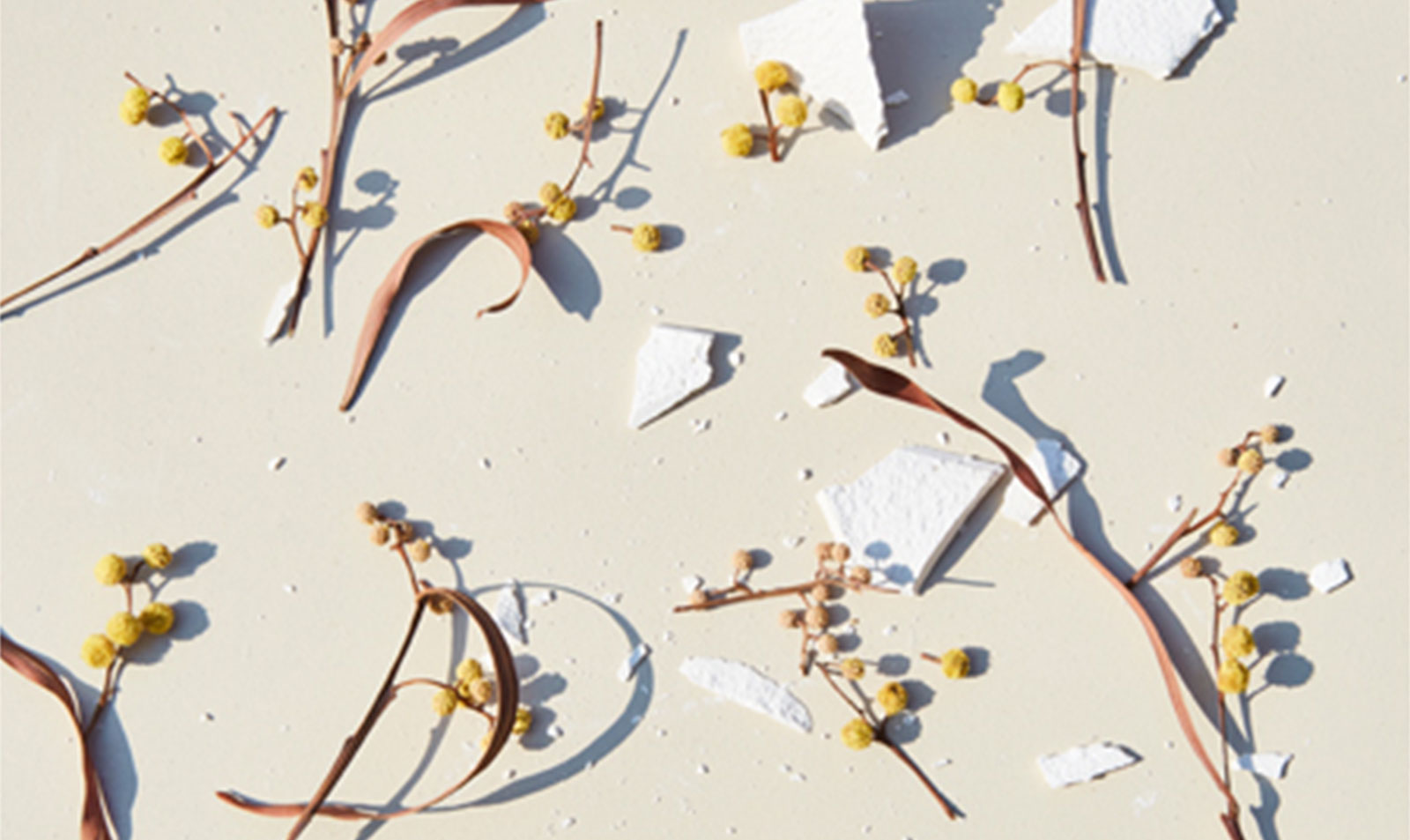
2. 好きな色かどうかは分かりませんが、私の作品に度々登場する色です。
私は、スタジオのライトでで黄金色を作るのが好きです。
スタジオの中で、例えば光もそうですが、屋外の事象を再現することに興味があります。
1度、日の出から日没までの光を表現したこともありました。
3. イエローは嘘をつかない色。
黄色い服を着ていたら、間違いなく、光を放っているわけですから心から自信を持たないとなりません。
何もかも包み隠さずに明らかにしてしまうのです。
4. 絵文字のスマイリーも思い出しました。
もし、ピンクのスマイリーだったらどうなるでしょう?
5. 子どもの頃はイエローが嫌いでした。好きになるには複雑すぎる色だったんです。
幸福な色ではないし、長い間見ているのは辛いし、ピンクやブルーのようには表現し難い色でした。
よくハッピーな色と言われていましたが、子どもの頃はハピネスには興味がないものです。
なんで私はイエローが好きじゃないんだろうかと思っていましたが、いつからか好きになることが出来るようになっていました。
好きになれた理由は嫌いな理由と同じで、イエローが複雑で理解することが出来ないからでした。
それはまさに成長の概念そのもののように感じました。
6. 個性と明瞭さ。
7. 10代を過ごした実家のリビングルームの壁の色。
それは、2000年代にフランスで流行した壁の色でした。
母は、地中海スタイルを目指していたんだと思います。
それは私の好みではありませんでしたが、今ではもうその家は出てしまったので、ノスタルジーを感じます。
‘COMPLICATED’
1. As my astrological sign is Leo, I cannot see something else than the Sun in the first place.
It’s my ruler! and...
I came from the south of France, I was raised in Toulouse, it’s a beautiful sunny city called the “pink city”.
It’s something I miss a lot in Paris right now.
2. I’m not sure if it’s my favorite color, but surely the one I use the most in my pictures.
I like to have a “gold” feeling in the light I create in studio.
I’m interested by matching outdoor stuffs in a studio situation, in the light too.
I tried once to reproduce the sunlight during a day in studio, starting from the sunrise to the sunset.
3. Yellow can’t lie.
If you wear a yellow outfit, it could happen.
You have to feel very confident with yourself because you’ll shine!
It’s a revealer.
4. Smiley face!
What if we had a pink smiley face?
5. I didn’t like yellow when I was a kid, it’s a complicated color to like.
It’s not really a peaceful color, it can also be painful to look at yellow a long time.
It’s not easy to identify, not like pink and blue.
We use to say it’s a “happy” color, but you don’t really care about happiness when you’re a child, it’s not a concept you’re interested in.
And I asked myself why I didn’t like the yellow.. and I started to like it.
For the same reasons I didn’t like, because it’s a complicated color, because you can’t tenderise it and it’s really meant something, a concept you create by growing up.
6. Individuality and clarity.
7. The wall of the living room of my family house when I was a teenager.
It was a “trendy” color for wall in France in the 2000s.
I think my mum choose it to create a “Mediterranean” style.
I didn’t like it, but now we’ve moved out and I feel really nostalgic about this living room.