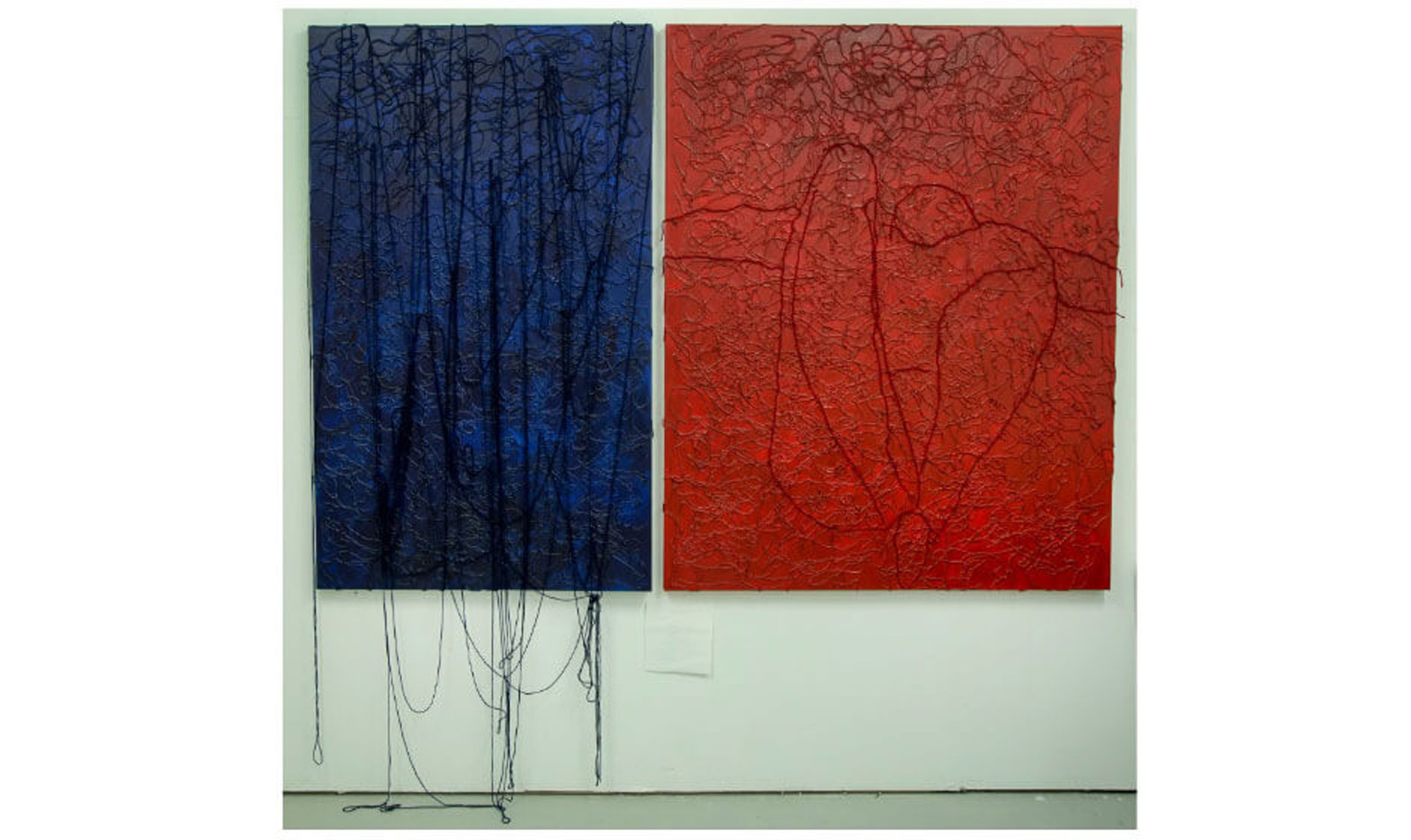
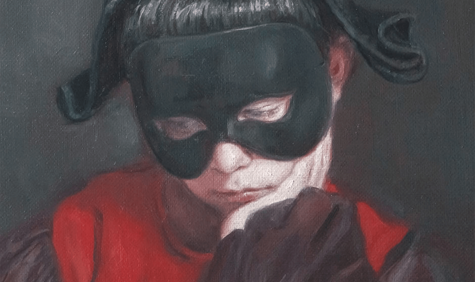
Top Photo:Untitled, 2016, 36” x 60” and 48” x 60” ©JinHee Kim
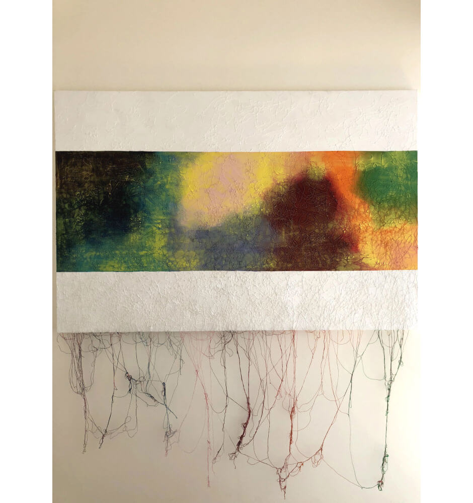
Inside of You|JinHee Kim
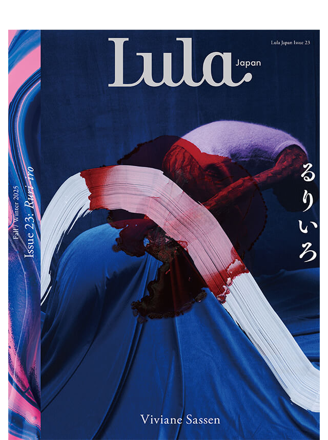
クリエイターが語る、「紅色」から連想するもの


RELATED ARTICLES

LATEST TOPICS
PICK UP
-
- Fashion
- 31.Oct.2025
-
- Fashion
- Art&Culture
- Beauty
- Encounter
- 01.Oct.2025
-
- Fashion
- Art&Culture
- 04.Nov.2025
-
- Fashion
- 06.Nov.2025
-
- Art&Culture
- 03.Nov.2025
-
- Fashion
- 14.Oct.2025
-
- Art&Culture
- 04.Aug.2025
-
- Fashion
- 14.Oct.2025
-
- Fashion
- 25.Aug.2025
-
- Encounter
- 11.Sep.2025
-
- Beauty
- 17.Sep.2025
-
- Fashion
- 08.Sep.2025
-
- Encounter
- 30.Sep.2025
-
- Art&Culture
- 01.Aug.2025
-
- Fashion
- 25.Jun.2025
-
- Fashion
- Art&Culture
- Beauty
- 20.Jun.2025
-
- Fashion
- Art&Culture
- 13.Jun.2025
-
- Fashion
- Art&Culture
- Beauty
- Encounter
- 09.Jun.2025
-
- Fashion
- Art&Culture
- 13.Jun.2025
-
- Fashion
- Art&Culture
- 04.Jun.2025
-
- Fashion
- Art&Culture
- Beauty
- Encounter
- 22.Apr.2025
-
- Fashion
- 15.May.2025